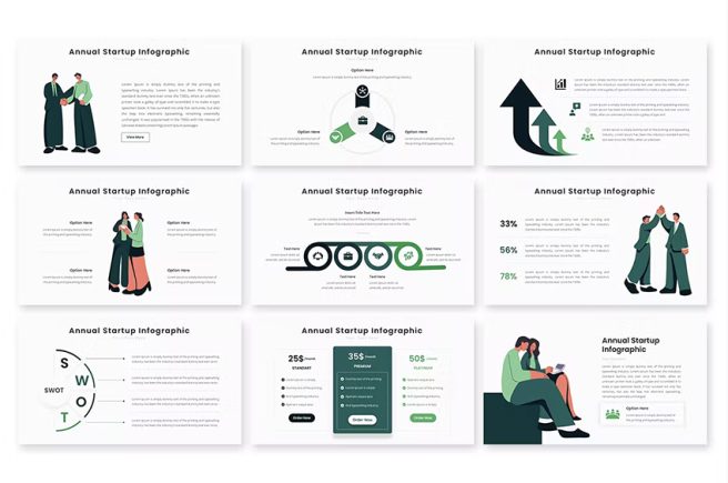
Autocharts in PowerPoint 2023 can be a daunting task, especially for those who are not familiar with the program. However, with the right tools and guidance, you can create charts that are not only visually appealing but also convey your data effectively.
In this article, we will provide a step-by-step guide on how to customize auto charts in PowerPoint. We will cover topics such as choosing the right chart type, formatting data, adding labels, and customizing chart elements. By the end of this article, you will have the knowledge and skills to create stunning charts that effectively communicate your data.
Choosing the Right Chart Type
The first step in customizing auto charts in PowerPoint is to choose the right chart type. PowerPoint offers a variety of chart types, including bar, column, line, pie, and scatter charts for your presentations or a pitch deck. Each chart type has its strengths and weaknesses, so it is important to choose the right one for your data.
For example, if you want to compare values across different categories, a column or bar chart may be the best option. If you want to show the relationship between two sets of data, a scatter chart may be more appropriate. PowerPoint’s chart recommendations feature can help you choose the right chart type based on your data.
Formatting Data
Once you have chosen the right chart type, the next step is to format your data. PowerPoint makes it easy to import data from external sources such as Excel. You can also manually enter data directly into the chart data sheet.
When formatting your data, it is important to ensure that it is accurate and relevant to your chart type. You can use the Chart Elements and Chart Styles menus to customize the appearance of your chart.
Adding Labels
Labels are an important element of any chart as they help the audience understand the data being presented. PowerPoint allows you to add data labels to your chart to display information such as category names and values.
To add labels to your chart, simply select the chart and click on the Chart Elements menu. From there, you can select Data Labels and choose the type of label you want to display.
Customizing Chart Elements
Finally, you can customize various chart elements to make your chart more visually appealing and effective. For example, you can change the color and font of your chart, adjust the axis labels, and add a chart title.
You can also use PowerPoint’s SmartArt feature to create complex diagrams and visualizations. SmartArt offers a variety of templates for different diagram types such as process diagrams, hierarchy diagrams, and relationship diagrams.
Customizing auto-charts in presentation designing can help you create more engaging and effective presentations. Auto-charts are pre-built charts and graphs that are automatically generated based on the data you input. While these charts can be helpful in visualizing data, customizing them can help make them more impactful and better suited to your presentation’s needs.
Here are some tips for customizing auto-charts in your presentation:
- Choose the right chart type: Different types of data require different types of charts. For example, line charts are best for showing trends over time, while bar charts are better for comparing data points. Choose the chart type that best suits your data and message.
- Adjust the colors: Default chart colors can be bland or clash with your presentation’s color scheme. Adjust the colors to match your presentation’s theme or brand, making sure they are visually appealing and easy to read.
- Simplify the chart: Sometimes auto-charts can be overwhelming with too much data or too many categories. Simplify the chart by removing unnecessary data or grouping categories together. This can make the chart easier to understand and more impactful.
- Add annotations: Annotations such as labels or callouts can help draw attention to important data points or trends in the chart. Use annotations sparingly and strategically to avoid cluttering the chart.
- Use animation: Animation can help bring the chart to life and make it more engaging. Consider adding animation to show how the data changes over time or to highlight specific data points.
In conclusion, customizing auto charts in PowerPoint is a simple yet powerful way to effectively communicate your data. By choosing the right chart type, formatting your data accurately, adding labels, and customizing chart elements, you can create charts that are visually appealing and informative.
A presentation design company is a professional service provider that specializes in creating high-quality, visually engaging presentations for clients across various industries. These companies typically have a team of skilled designers, artists, and writers who work together to create custom presentation designs that are tailored to the client’s needs and objectives.
We hope that this guide has provided you with the knowledge and skills to create stunning charts in PowerPoint. If you have any questions or suggestions, feel free to leave a comment below.

